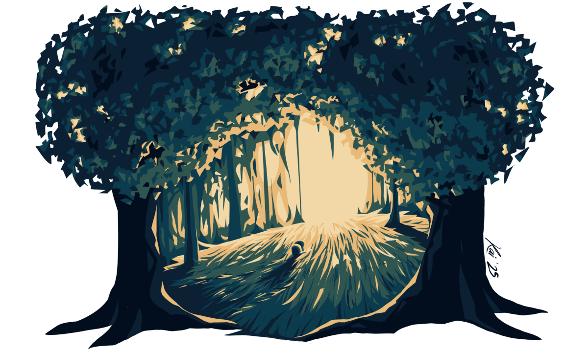
Entering the school year, we welcome novelty: new classes, new people, new experiences. But this year, we can also expect an additional surprise. Soon, we will be face to face with a brand new mural in the counseling center, painted by Kai C. ’26. In the following interview, Kai writes about the inspiration, process, and meaning behind this exciting new project.
Q: Can you give a quick description of your mural (title, theme, visual components, etc.)?
A: I don’t actually have a title for it yet, but I’m thinking of keeping it that way since I want the focus to be the atmosphere the mural creates. The mural itself is of a grassy area surrounded by trees with a bright glow emanating from the background. The grass sweeps outwards from the background. Near the center, there is a “blob guy” (as I’ve been calling the species) looking towards that light. The scene is framed by two large trees on the right and left. Six colors are used: Straw, Soft Marigold, Yukon Green, Hidden Sapphire, Deep Royal, and Midnight Dream. For simplicity, it is pastel yellow, orange, slightly-blue-ish green, slightly-green-ish blue, navy, and pretty-much-black. The mural is unlined and has no gradients. (All the colors are in blocks.)
Q: Have you created public art like this before? What other projects have you worked on?
A: Nope! This is my first time painting a mural and also my first time painting at this scale. I will say, however, that the Larger Than Life project in Intermediate Drawing and Painting was a larger piece that utilized a projector for sketching, similar to the mural. In terms of style, the portrait painting in Intro to Drawing and Painting was the most similar assignment I’ve completed. Since then, I’ve used a similar geometric, hard-blocked color style for quite a few of my digital illustrations, some of which I drew during my Independent Study last year.
Q: What inspired you to create this mural?
A: I’ve actually wanted to paint a mural for some time now. Online, I’ve read comics where characters paint murals; in reality, I love seeing murals in Seattle and other cities I visit. As a whole, the size of the canvas and the audience they reach just draws me in. (Pun not intended.) The best way to put it would be that murals create this sort of awe that I feel is hard to replicate in other forms. However, in realizing this goal, I often felt underqualified for this medium, so I never tried to make progress. But, after a brief mention of this bucket list goal, hearing of a coincidentally empty wall, and the enthusiasm from Ms. Swanson, one thing led to another… and here we are. I definitely learned so much more actually doing than just imagining, and I’m so glad I took the opportunity. It’s been an absolute blast.
Q: Can you walk through your creative process from the first ideas to the final product?
A: The mural was designed based on the vibe we wanted to match in the Counseling Center. I also took photos of murals I saw in Seattle and travel locations for inspiration. With those, I brainstormed some rough ideas and color palettes, then refined them by adapting those ideas to the space provided and the time available. I did play around with designs that went around the corner into the hallway, but they mostly ended up being scrapped. It is still possible, but due to time constraints, it would have to be designed and painted after the main section is finished. Once the concept was chosen, I finalized the design and color-picked my six colors to match them with swatches at paint stores. Then, I used a projector to line the design up to the desired location and outlined the color blocks with a pencil, remembering to label each section. Lastly, painting. Following the sketch, I’ve been painting the design onto the wall. Currently, I’m still on layer one, but it’ll likely need two or three layers to be fully opaque. (Layer by layer, rather than color by color, allows for easier edge adjustment if necessary.)
Q: Did the location — the counseling center — influence the message or tone of your work?
A: For sure. The atmosphere of the Counseling center means it can’t be too bright, energetic, or moody since students use that space as a calm resting area. A mural there should complement the inviting and comforting feel of the room.
Q: How do you hope students and staff will feel when they see your work?
A: Similar to question five, the mural was designed to, hopefully, feel comfortable. I also hope it’ll inspire others to create art for the Lakeside community!
Q: As you work on this project, have you faced any challenges? If so, how did you overcome them?
A: As mentioned, I felt—and still feel—somewhat inexperienced. Mr. Boccuzzi was a great help with logistics, and his patience and painting tips are greatly appreciated. Mr. Cook’s experience with painting was so helpful in choosing paints, figuring out feasible styles, and appropriately setting up the space with all the necessary tools. For generating ideas and finalizing a design, I leaned on Ms. Swanson, Mr. Boccuzzi, and the school community. (Thank you for responding to my Post-it note!) I also used my online art community to choose a color palette for the design. I thank everyone who helped paint the mural, including Felicity W. ’26, Brisa G. ’26, and Zoey C. ’27. Last, but not least, many thanks to the Lakeside staff who helped prepare the space for painting. The scaffolding is SUCH a help.
Q: Any other thoughts you would like to share?
A: Get out there and try the new things, especially if they’re on your bucket list; it’s much, much less complicated than it may seem! Live, learn, and have fun <3
Next, I learn to backflip…


